As we enter a new year, a new release of WordPress is rapidly approaching, but what can you expect to see in this release? Let’s dig a little into the features and find out what’s coming in WordPress 5.9.
This release is an important one, so important it took a little longer to get to everyone than the usual end of year release – but it’s so worth the wait. It’s important because it sees the start of the path to site editing. Why the start? Well, it’s still going to be in beta. There is also a new default theme, Twenty Twenty-Two and a whole range of features that take full advantage of site editing. The scene is set for an exciting year in WordPress, but what are the key elements coming?
Site editing beta
Let’s start with the essential item, the beta itself of site editing. What does this mean? In simple terms, this means editing everything, not just the content area. Blocks have been great, but they have been confined to a section in a post or page. WordPress 5.9 brings templates and parts to see site editing blossom in WordPress.
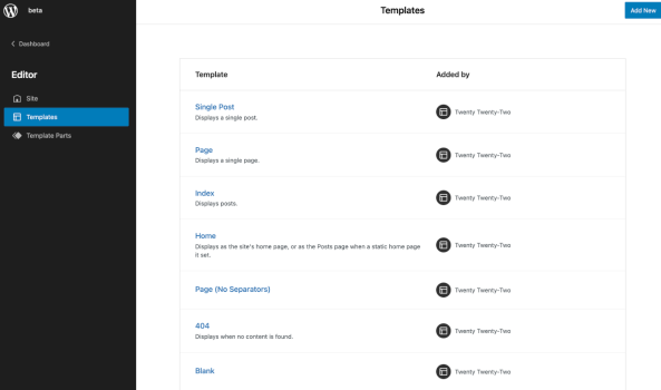
This vast feature has been simmering for a long time, and it’s grown through countless contributions and iterations. WordPress 5.9 sees a point reached where it’s ready for beta and exploring. From the template selection screen to the way you can add and interact with parts themselves, the entire experience is quite familiar to anyone who has used a page builder along their journey. You pick a template, configure it how you want using parts, and then save it to use on your site. It’s a familiar format.
Templates, parts and patterns… That’s what makes up site editing.
The fundamental features of site editing boil down to templates with patterns that are collections of blocks. A site editing capable theme can declare templates and parts, and also what block and pattern each start with. From there, it’s up to the person creating content to dive right in and configure.
Patterns are at the heart of the experience. If you want to go even further, there’s the pattern directory, and here at Extendify, we’re offering a whole library full of patterns being built on that foundation, ready to work with WordPress 5.9 and Twenty-Twenty Two.
Twenty twenty-two is full of patterns
The new default theme takes full advantage of site editing and patterns. This theme comes packed full of an incredible range and an array of templates to select.
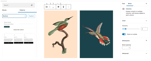
Patterns are grouped into sections which makes a lot of sense in post view but comes into even more logic when using the templates themselves. Here you can see adding a pattern to the template; you can see the label indicated. Seeing where you are is something this release of WordPress brings in several editor areas.
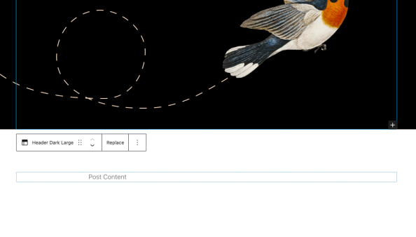
Twenty-twenty-two really is a packed theme full of refreshing templates, parts and patterns. With a simple add or swap of a piece, you can create beautiful layouts that took some editor know-how in past versions.
List view refinements
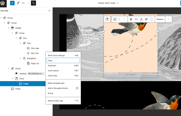
Content with lots of options needs the ability to drag and drop in list view, and you now will have that in 5.9. This is just one of the many experience improvements and refinements. This looks like a simple interaction but brings list view into its own as a full interface.
Welcome to styles
We’ve had theme.json for a while to explore, and the interface now has refined to a point where it allows some creation.
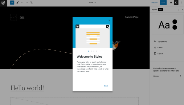
As the screen says, ‘welcome to styles’ is the first official introduction of this feature that sees the visible part of theme.json. It’s also changed a lot since previous versions. There’s much to love here and lots to build on in the subsequent few versions. If anything, that perhaps is the most significant theme of 5.9 foundations. It’s a starting point from which to build site editing.
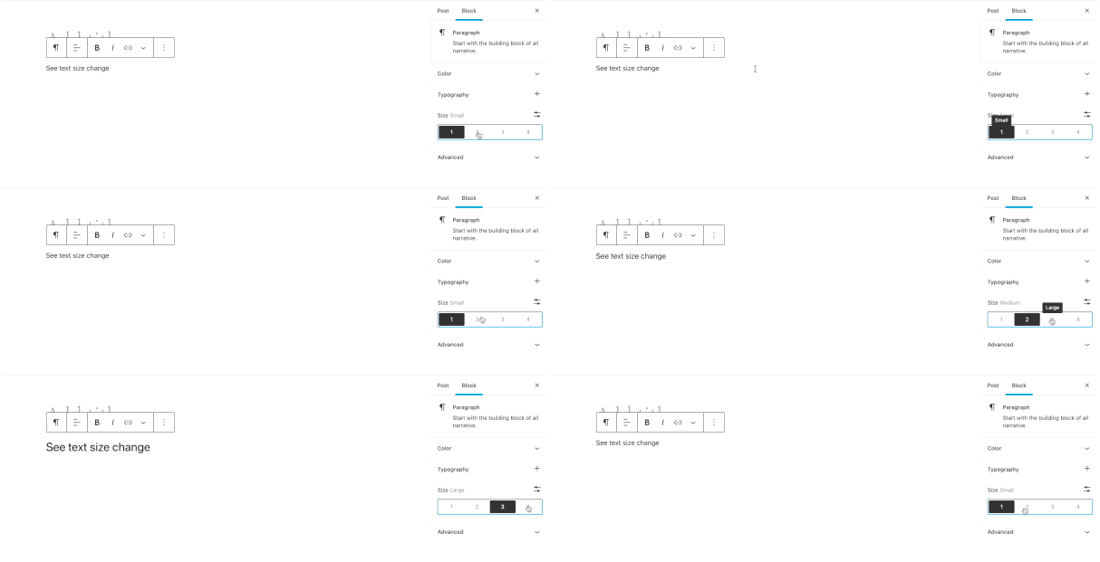
More control in your posts with styling
Styles are often thought of as just for site editing, but they are also for your posts too. For example, if using a theme that supports it the new interface allows great control over font sizes.
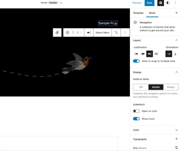
Navigation block
A fundamental block now evolved in 5.9 is navigation. This has come into its own through multiple evolutions, and now you can see the power of this block start to flourish. There’s a lot to dig into with this, from orientation to display and submenu settings. It’s also just the start because navigation is a core part of any site, and as with many other features, this is just starting in 5.9.
Quality of experience
If there were a secondary theme to the main at site editing, it would be refinements and polish. 5.9 sees edges smoothed and power features boosted throughout the editor. There is a wide range of these, from heading controls to seeing block styles simplified but more accessible. With this release, it truly feels like the editor is maturing into the foundation it needs to be for site editing to grow on.
Dive in now
It’s a great time to take 5.9 for a spin right now as the beta four just dropped, and it’s due at the end of January if everything stays on track. Jump right in by following along with these links:
Find out more about this release here:
Join us over this year for more posts looking at the exact features of 5.9 and don’t forget to tell us on Twitter what you’d like to see written about.